Project Summary
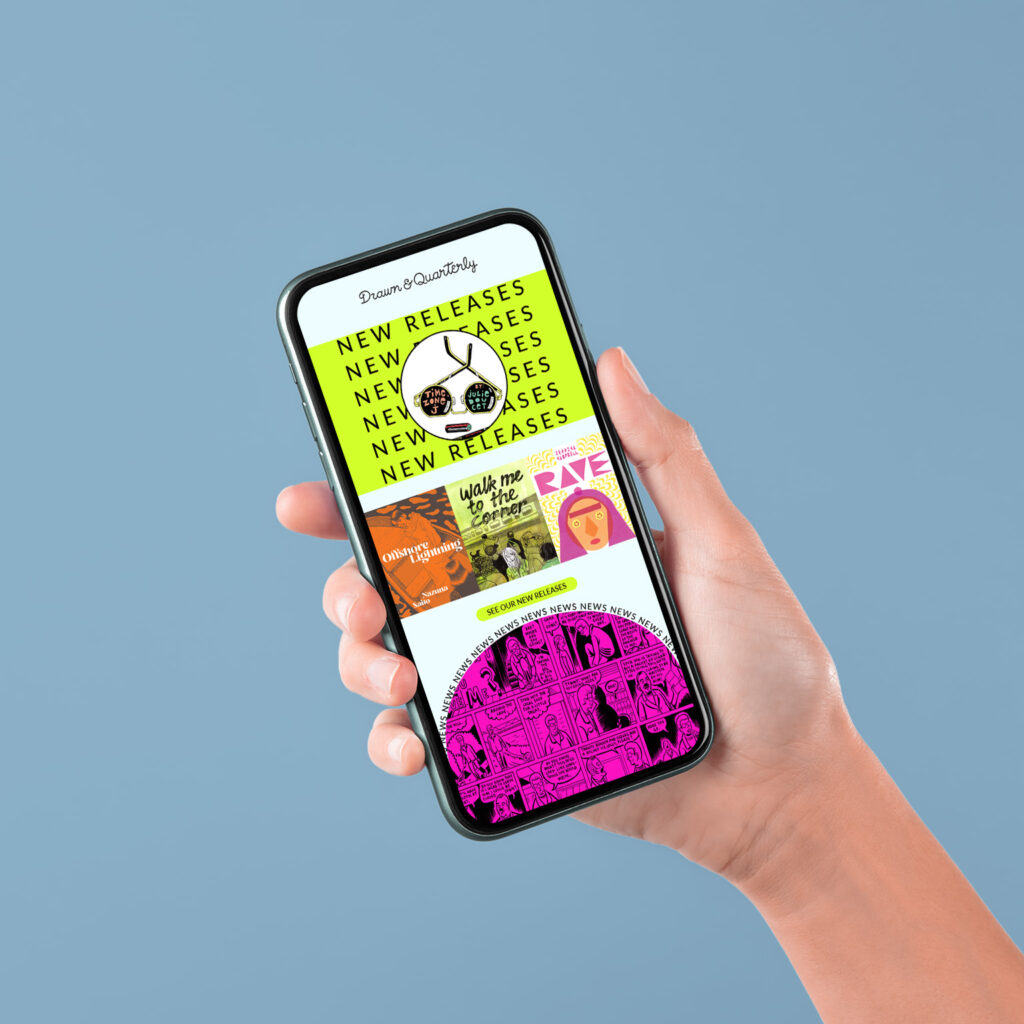
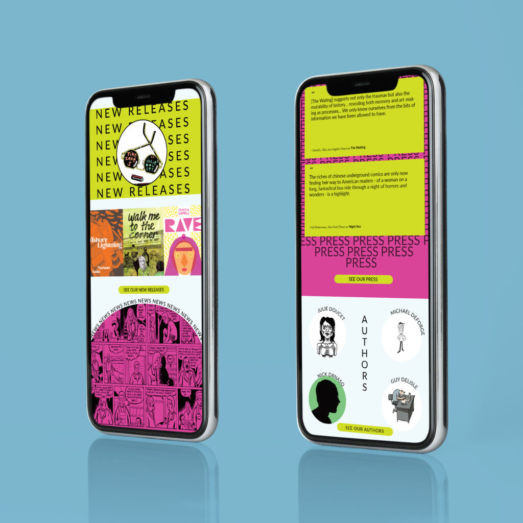
For this email newsletter, we had to choose between 4 clients to create an email newsletter that reflected their brands. I created this newsletter with Indesign and I went with a more flashy and trendy look and feel with the colour and the text. It is a bookstore company and they have fun visuals and they use a lot of colours. For this newsletter, I wanted the clients to read the books or go visit their website. This project helped me understand what is a brand identity. Projects for clients need to feel cohesive with their branding.
Project Description
- Format: 600px x 2500px (2500px is the minimum height)
- Include your client’s logo, images and text, but don’t limit yourself to the look of their website.
- You decide what content will be included in the newsletter.
- Propose 2 different layout options (see example below).
- Use a grid and align images and text to your margins and guides.
- Create a mockup of your newsletter
Research
Before this project, we had to send some inspirational pictures and pictures for the client’s website that we found interesting. By doing this, it helps me to draw down some ideas of what I wanted my newsletter to look like. For this Newsletter, I searched on the client’s website and found a bunch of colours so I decided to use light blue as the background colour. I paired it with a flashy green and pink to make it stand out and capture the client’s attention. When I think of newsletters, I think of boring and no one takes the time to look at them, but by adding an interesting layout and colours it would grasp the attention more. On their website, the font that they used is Inter, since it is a very simple minimal font I used it a lot of different ways and mostly in a repetition technique. That makes the font stand out without being too distracting and takes up too much visual space.


