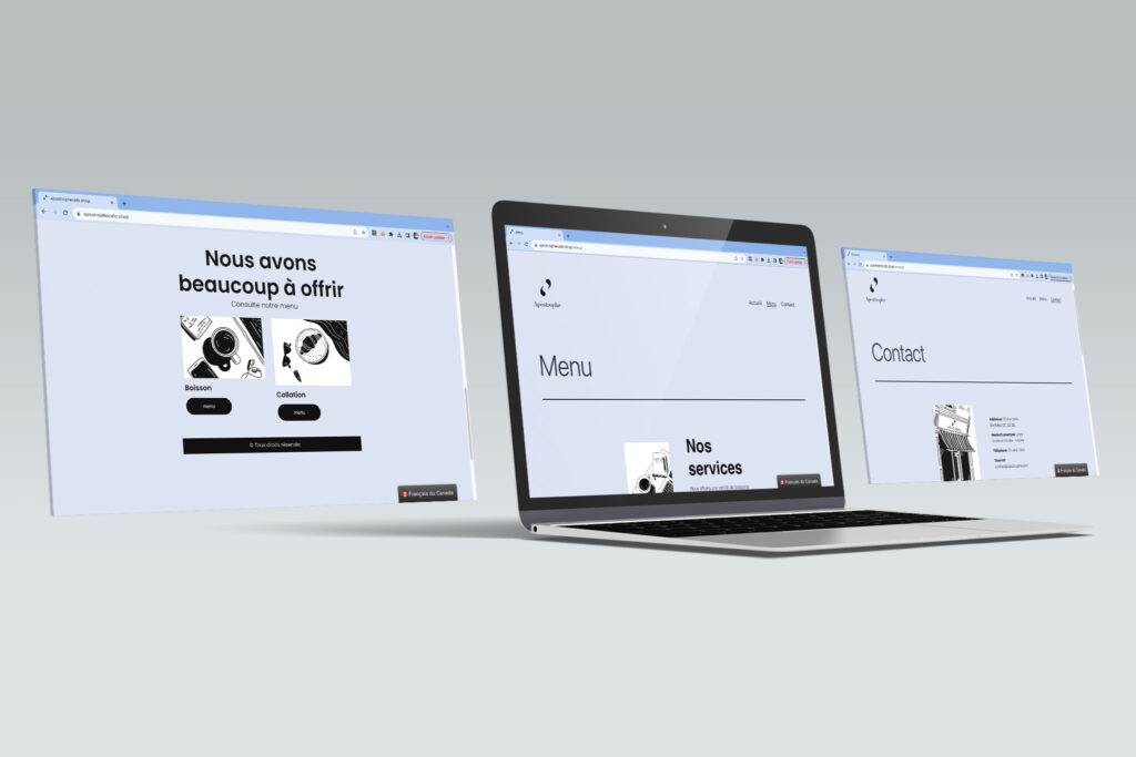
Apostrophe website
Project Summary
For this project, I needed to invent a company in Montréal that was either a coffee shop, a bar, or a Restaurant. I decided to create a website for a coffee shop that offers a calm and relaxing place to read or study.
Project Description
- live site on 3rd party hosting, MIO screenshot of backup on OneDrive
- Responsive, bilingual/ follows OLF rules, error-free
- Sufficient text and layout elements to clearly show site concept/ subject, clear CTA
- On-Brand (including domain name)
- demonstrates mastery of UI/ UX , accessibility, and usability
- Eco-friendly factors are considered
- Professional quality and creativity (does this look like material that would be used by a “real” business?)
Research
For this made-up business, there were many projects that led to this website, like a persona research, an infographic to see which location would be the best for the clientele, an ad in the form of a poster, and the creation of a logo and business cards. For the personas, I had three types of clients which would be the typical clients of this coffee shop. The clientele this coffee shop wants to reach is people who want to study or read in a quiet and calm space. Even people who want ethically sourced coffee, different milk options, and healthy lunch choices. For the colours, I choose a light blue, because it is calming and soft and it is inviting for those who are seeking a quiet place to drink their coffee. For this website, I wanted to go minimal and clean since it is the vibe that this coffee shop is trying to achieve. I also drew all the illustrations on that website and did them only in black and white. They all have the same look and feel and it is more coherent throughout the website. I also chose a simple sans-serif font which makes it more calm and inviting the the clientele it is trying to reach.
