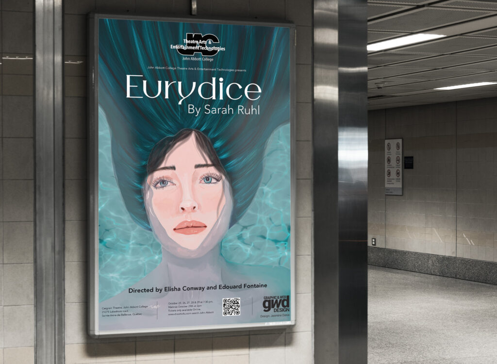
Eurydice poster
Project Summary
This is a poster that I created for the Theater program at John Abbott College. This represents a girl in the water. The play is about a girl dying on her wedding day and going to the underworld which is represented by water. I chose a delicate and feminine font for the title. that fits with the touch and feel of that play. I also paired it with a simple sans-serif font that doesn’t take too much visual weight. I chose the colour blue as my main colour because it represents the sadness of her death but also her transition to the underworld.
Project Description
An 11×17 poster with 300 ppi for print purpose
integrate the theatre program logo
create our own art or images
integrate the information about the play and a QR code for tickets
the name of the writer and directors of the play
Research
“Eurydice” reimagines the classic myth of Orpheus and Eurydice not through Orpheus’s infamous pilgrimage to retrieve his bridge, but through the eyes of its heroine. Dying too young on her wedding day, Eurydice must journey to the underworld, where she reunites with her father and struggles to remember her lost love. With contemporary characters, plot twists, and a script written to be a playground for designers, the play is a fresh look at a timeless love story.
Eurydice and Orpheus should be played as though they are a little too young and a little too in love. They should resist the temptation to be “classical.”
The underworld should resemble the world of Alice in Wonderland more than it resembles Hades.
The stones might be played as though they are nasty children at a birthday party.
When people compose letters in this play they needn’t actually scribble them—they can speak directly to the audience.The play should be performed without an intermission.
