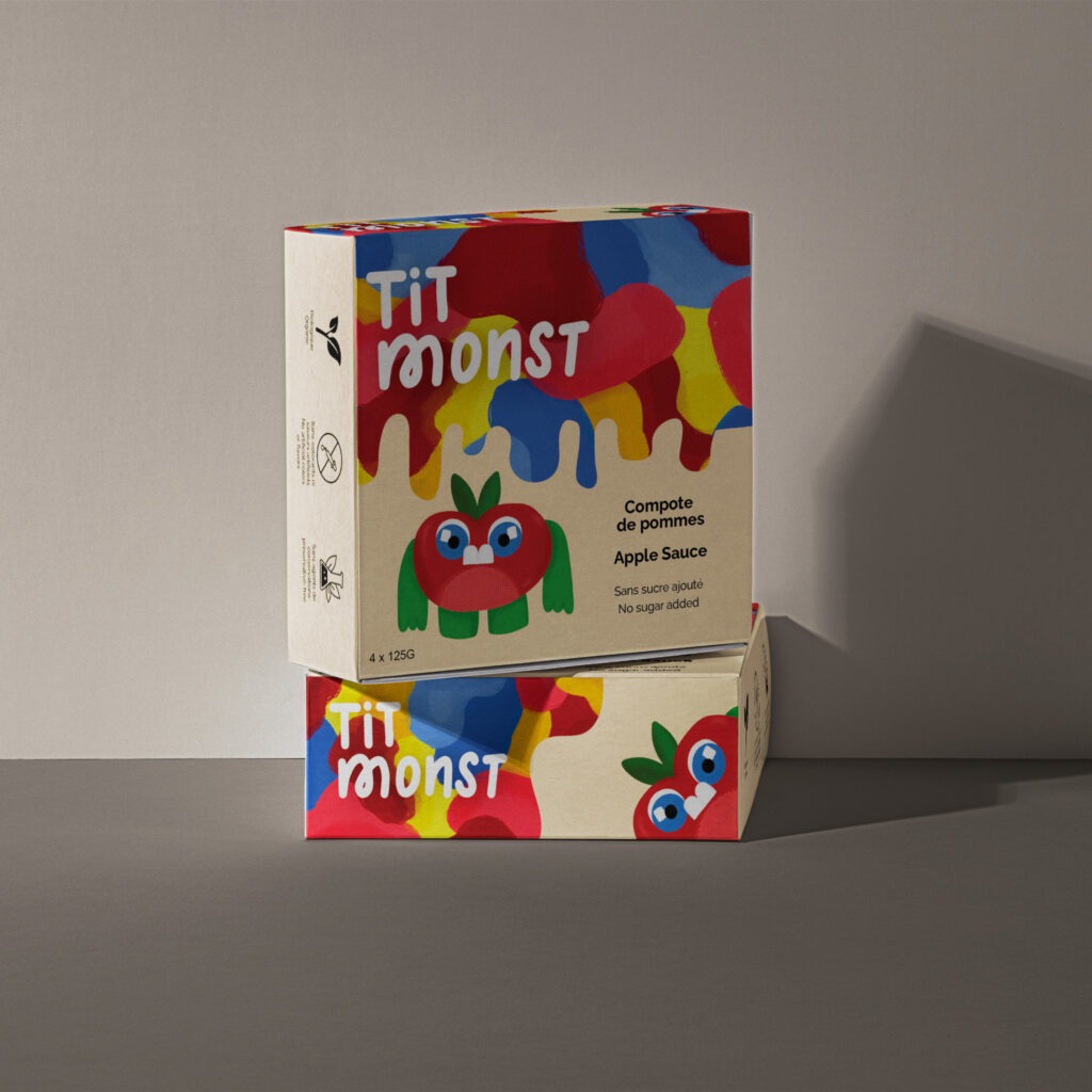
Tit’ Monst Packaging Design
Project Summary
I needed to create packaging for Tit Monst is a company that offers organic apple sauce. The target audience for this product is mostly children, but since they’re not the ones who can buy products, it is also targeted to parents.
Project Description
- Take into consideration the type of clientele who might buy each product and list some information about their demographic (age, gender, social status, income, cultural profile, etc.) and psychographic profiles (lifestyle, leisure, food, etc.).
- Start by doing research and mood board. Start sketching but keep in mind what emotional impact you expect to share with the customer. Remember that you sell much more than the product itself. Also, take into consideration that you target the product to parents but also appeal to the children as well.
- You also need to include all the requested information regarding ingredients, quantities, dosage, warnings (i.e.: allergies), etc. both in French and in English, and also a bar code.
Research
First, when I think of kid’s products I think of characters and that is why I have created a little apple monster because it represents the product but also it appeals to children. In addition, I researched the colours that are the most attractive to children (blue, yellow, and red) and that is the reason I used them. For the parents, I added elements that are more attractive to them such as using organic fruit, no additives, and no sugar added. Because parents want what’s best for their little ones, they’re going to be more prone to buy it. What most inspired me was monsters, and that is why I used the French words “petits monstres” which I modified enough so that it can be read both in French and English. “Petits monstres” is a French expression that refers to children with a lot of energy. I used an open-box concept because it is easier to take out the apple sauce this way, and you can see the products. I also feel like this kind of packaging is more appealing to the consumer for apple sauce.
