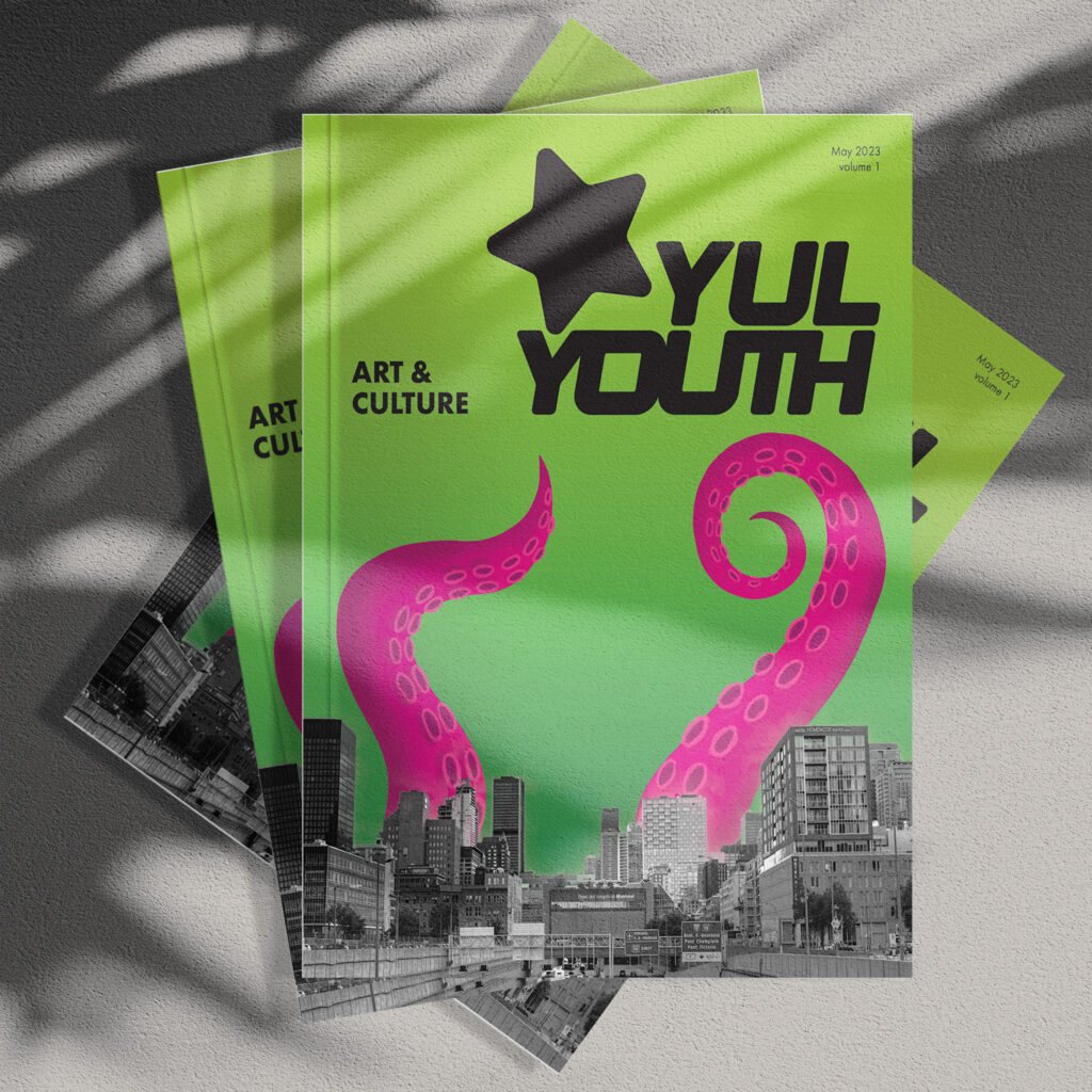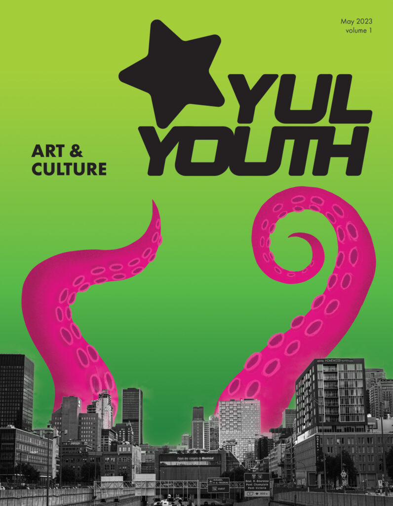

Yul Youth Magazine Cover
Project Summary
I created this magazine cover for a project. It is a project targeted at young adults who want to travel to Montreal. Inside the magazine, there are articles about cultural attractions in Montreal. For the cover, we could only use our own photos and illustrations.
Project Description
You need to create your own logo and integrate yul, mtl, Montreal
All the content must be yours (text, images, graphics)
The date and the volume must be indicated.
A tagline that introduces the magazine’s subject.
The InDesign document must include the following options:
Research
For our magazine, we got inspired by the Y2K era. Since it is targeted to young adults like us we grew up knowing these trends and the type of magazine that we read growing up. It would bring more people to read the magazine since by looking at it they would feel nostalgia. We chose the flashy green and pink as the main colours because it’s contrasting colours but also fit with our theme. For the magazine cover, I chose a black and white photo of the building in Montreal that I took and cut out the sky for the bottom because I wanted to integrate the city and I chose black and white to not be too much visually because already the colours are a lot. Then I added fun and grungy octopus legs coming out of the building because I thought it added to the designs and gave a good balance to the whole design while also tying it to the design inside of the magazine. I added also a green gradient background to give it an alien feel like I observed in a lot of Y2K magazines.
