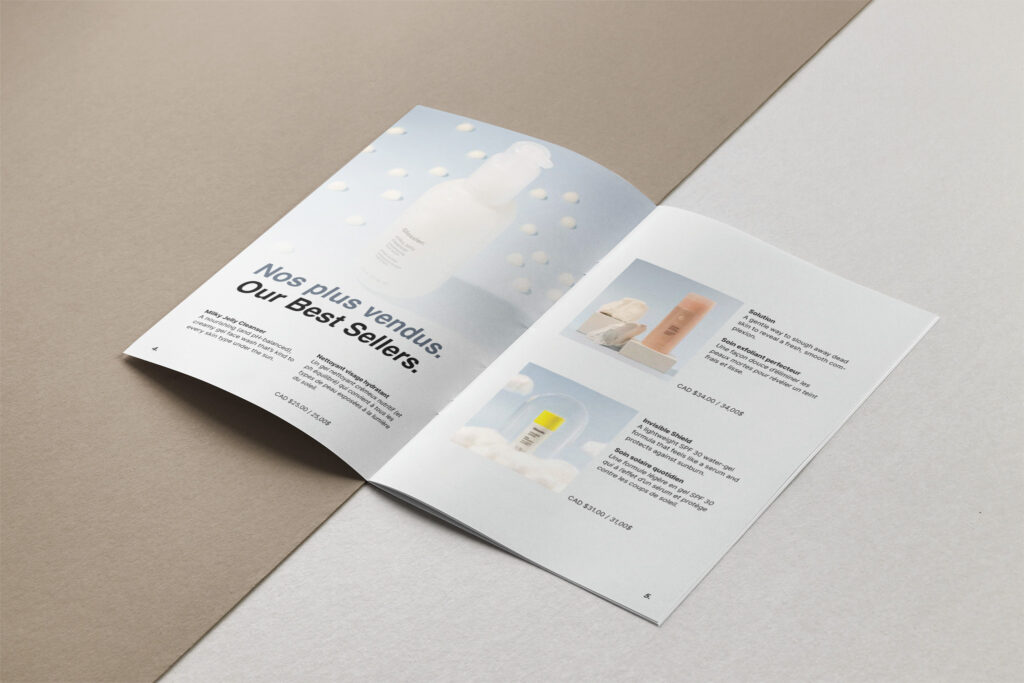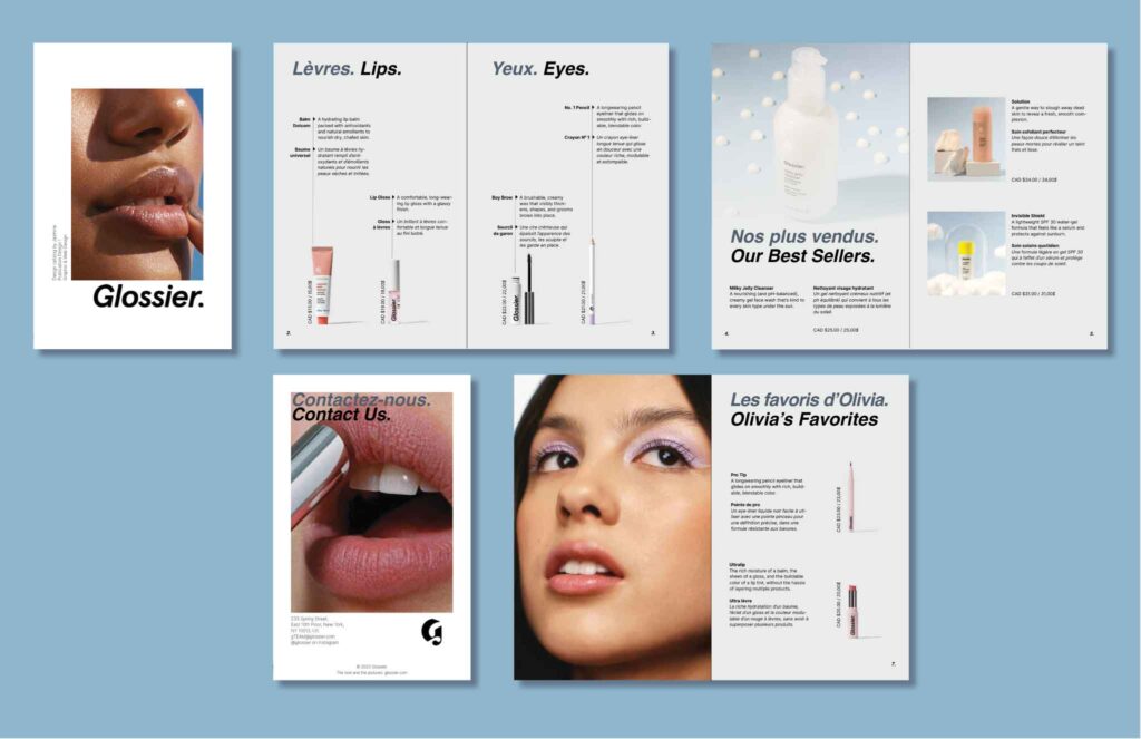

Glossier Catalog
Project Summary
I created this catalogue for a publication class and I needed to create this for a brand. The brand that I chose was Glossier because I love their products and I like their branding. For this project, I gathered the images first then I built my design around them because I think that visuals are the most important for this brand.
Project Description
You are asked to design and produce an eight-page catalogue booklet. You will feature your mini-book in half-page portrait format (8.5” x 5.5”) and will bring in text files, images, and artwork. Please put, the catalogue name as a header, and the page numbers as a footer. You will print the InDesign catalogue as a double-sided booklet. Every product needs a title, a short description and the price in French and English.
The InDesign document must include the following options:
- Master page;
- Automatic page numbering;
- Header and/or footer;
- Layers to separate text from images;
- Body text fixed on the baseline grid;
- Proof-read material for both languages;
- Paragraph and/or character styles;
- Images;
- At least one Pantone colour + one colour mix.
Research
First, I researched their website and that they have strong branding. They use big images and close-ups of faces to put their products out front. They also use a simple sans-serif font in small so it does not take too much visual space compared to the images. For the titles, I love how they use italics for their logo so I wanted to use italics for titles. In addition, even though they use pink as their main colour, I went with another blue-grey colour for the titles and a lighter version for the background, because I thought this colour was more fitting with the picture of the products that I used. They also have a very clean design and this blue colour strengthens this choice.
