

L’Heure Mauve Trifold
Project Summary
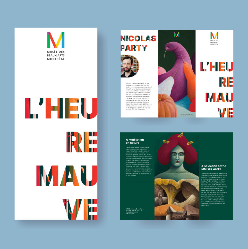
For this trifold brochure, we had to choose between 3 clients. I choose the museum because I’m very passionate about art. I thought it was going to be a great challenge to mix such complex and beautiful art and graphic design.
Project Description
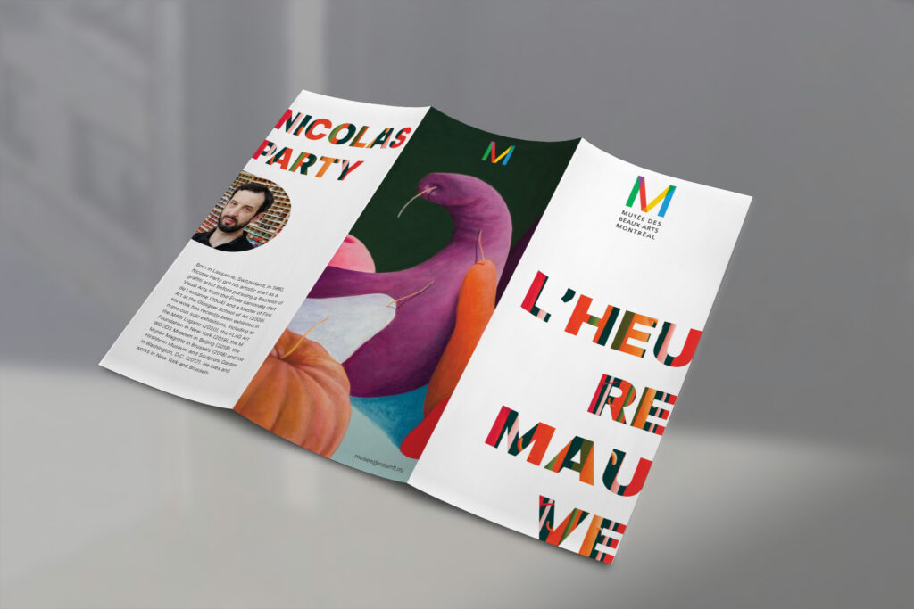
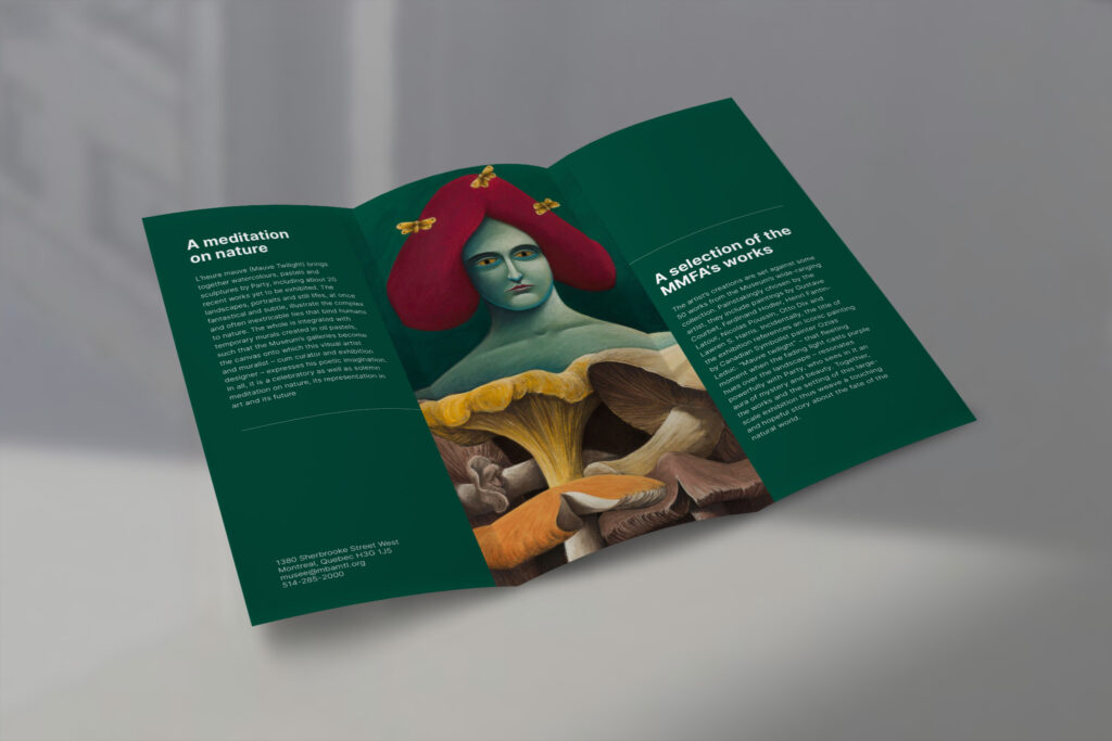
We needed to create a trifold brochure for an art exhibition, and we had to include:
- the client’s logo
- the client’s colours and typography
- the client’s imagery (photos and/ or illustrations)
- the client’s contact information (physical address, phone number, web address)
- Use a grid and align images and text to your margins and guides.
Research
For this project, I researched the museum’s website for the colours and the information. I first gathered all the text I needed for that project, then found some of the visuals that represented the exhibition. For more research, I went and visited the Museum to see in which direction I should go. I know that huge art pieces covered the walls, and this artist used a lot of colours and forest green. That is why I used his artwork and put It huge on the page to really put it in front and for the people to appreciate his art. On the cover, I wanted to tease the client by adding some of his work to the titles. By doing this, you want to open it and know more about it. With the big images taking a lot of the attention, I balanced that with minimal text and white spaces.
